Indian Companies Logo Along With Means
Namaste India,
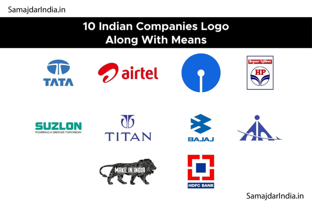
Make in India: make-in-India’ is a lion’s step logo launched in September of 2014. The logo has the silhouette of a lion on the prowl, made entirely of cogs, symbolizing manufacturing, strength, and national pride. Come and make it in India whatever you want. My country is powerful. Come, I am giving you an invitation,’ is the essence of Modi’s development mantra.

TATA: The Tata logo is eye-catching for its simplicity. ‘T’ letter in blue stands for the group’s reliability, strength, and prosperity. It also signifies a tree of trust and a fountain of knowledge.
SBI: SBI logo represents a keyhole which means the common man can unlock all his/her banking needs. Originally SBI logo was a banyan tree when first designed in 1955. The current logo was designed in 1971 by Shekhar Kamat of the National Institute of Design (NID), Ahmedabad.

HDFC: Housing Development Finance Corporation (or HDFC) logo shows a square block at the center resembling a building and the four corner walls being cameras. It is a concept that reassures those who want a roof over their heads through housing loans. The logo signifies trust.

Bajaj Auto: In January of 2004 Bajaj Auto unveiled its new logo. Bajaj promises to live up to its 5 brand values viz., Learning, Innovation, Perfection, Speed, and Transparency. Bajaj replaced its traditional symbol with an open abstract form of stylized B, the “flying B” as it has been named to represent style and technology to denote speed and transparency.

HP: The curved lines joining together like a stream of energy fuel being poured into a vehicle.

Titan: This Logo was designed in 1987 for TITAN Industries which is a joint venture of Tata Group and Tamil Nadu Industrial Development Corporation (TIDCO). The logo plays with the letter ‘T’ creating a circular hallow around it resembling a watch dial and the internal parts of machinery.

Airport Authority: Designed in the early 1990s, the Airport Authority of India logo uses a triangular form and the wings of an airplane kindling vision of the airport.
Airtel: Airtel’s new logo is a single ‘a’ presented on a red background followed by Airtel written underneath the letter ‘a’. Re-designed in 2010. The unconnected letter ‘a’ represents ‘no boundaries’ as Airtel is exploring the world.

Suzlon: Its logo represents the wind flowing in a green background. The green color represents a greener tomorrow and a safer future.

